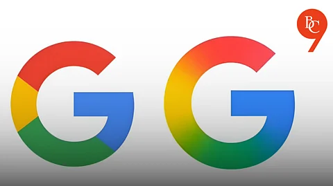

Google’s new ‘G’ logo replaces the familiar four solid color blocks-red, yellow, green, and blue-with a seamless, multi-colored gradient. This subtle but meaningful shift gives the logo a softer, more dynamic, and modern appearance, aligning it with the visual language of Google’s latest AI-driven products, such as Gemini and the AI Mode in Search.
Introduced in 2015, the segmented ‘G’ logo became a staple across Google’s apps and services, representing the company’s playful yet bold approach to digital branding.The updated logo blends the same signature colors into a fluid swirl, echoing the gradients seen in Google’s AI branding and offering a more vibrant, screen-friendly look.
The redesign comes at a time when Google is doubling down on artificial intelligence across its ecosystem. The new gradient logo is not just a cosmetic update-it’s a visual cue of Google’s commitment to innovation and its intention to integrate AI more deeply into its products. The move also aligns with the branding of Google Gemini, the company’s generative AI assistant, which already features a gradient motif.
The new ‘G’ logo is currently rolling out on the Google Search app for iOS and has appeared on some Pixel phones and Android devices running the Google app beta version 16. Most web platforms and non-Pixel Android devices still display the older logo, indicating a gradual, phased rollout over the coming weeks. As of now, the main Google wordmark and other product logos (like Chrome, Maps, and Gmail) remain unchanged, but the shift toward gradients suggests further updates may follow.
This is Google’s first major logo update since 2015, when it transitioned to a modern, sans-serif wordmark and introduced the color-block ‘G’ icon. The new gradient look is part of a broader trend within Google’s design strategy, emphasizing a unified, contemporary, and AI-forward visual identity. Experts believe this may pave the way for similar changes across other Google products to maintain brand consistency.
Early impressions describe the new logo as more colorful, vibrant, and in tune with today’s digital design trends. While the update is subtle-especially at small sizes-it reflects Google’s ongoing evolution and its efforts to stay visually relevant in a rapidly changing tech landscape.

